Web Design Trends for 2026: The Rise of 'Glassmorphism' and How to Achieve It with CSS
Whether you’re a UI designer, developer, or just curious about what’s hot in web design this year, this guide explores why glassmorphism is trending and shows you how to implement it using simple CSS.

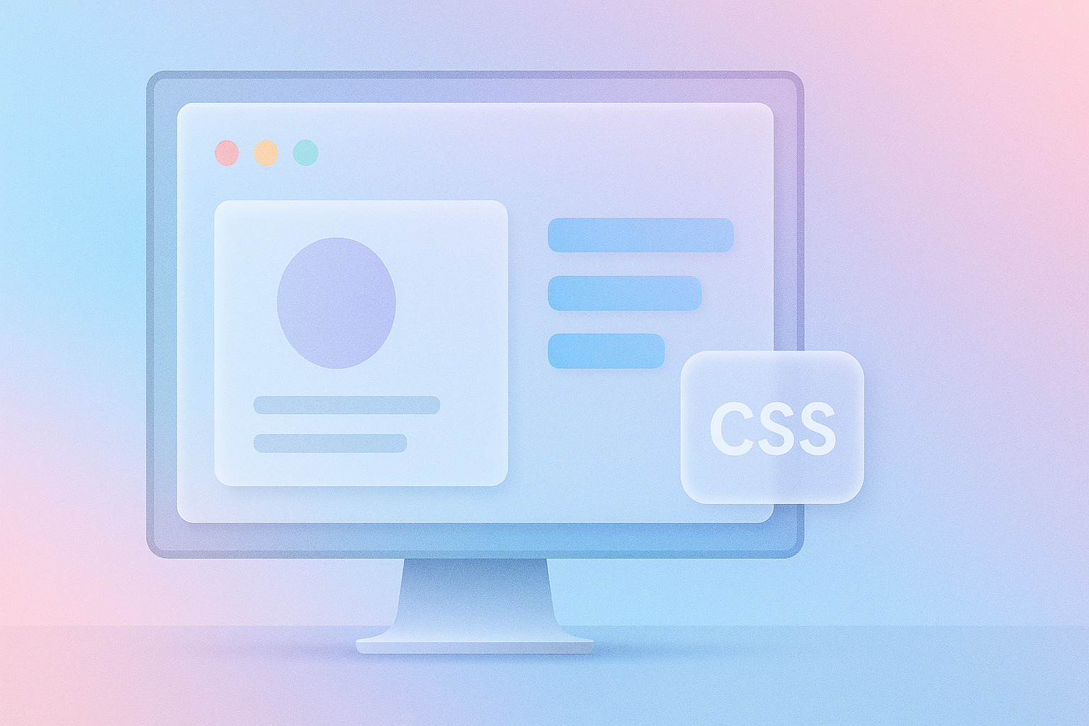
The web is constantly evolving—and in 2026, one design trend is dominating screens across industries: glassmorphism. With its frosted glass effect, vibrant translucency, and depth-enhancing visuals, glassmorphism combines aesthetics and usability in a way that feels futuristic yet accessible.
Whether you’re a UI designer, developer, or just curious about what’s hot in web design this year, this guide explores why glassmorphism is trending and shows you how to implement it using simple CSS.
💡 What Is Glassmorphism?
Glassmorphism is a visual design trend that mimics the look of frosted or semi-transparent glass. It creates a sense of depth and layering by using:
- Transparent backgrounds
- Blur effects
- Subtle shadows
- Light borders
Imagine looking at a UI element as if it were a pane of frosted glass over a colorful background. You can partially see through it—but the content behind is blurred and softened. It’s clean, modern, and dynamic.
🚀 Why Glassmorphism Is Trending in 2026
1. Aesthetic Appeal Meets Functionality
Users love designs that look cutting-edge but are still easy to interact with. Glassmorphism provides a balance of minimalism and texture.
2. Improved Display Capabilities
With high-res screens and modern browsers, even smartphones now render layered visuals and blur effects beautifully.
3. Influence of OS Design
Apple’s macOS, iOS, and Microsoft’s Fluent Design System have embraced glassmorphism. The web is naturally following suit.
4. Depth in Flat Design Era
Glassmorphism adds depth and dimension to the traditionally flat web UI without sacrificing simplicity.
🧪 How to Achieve Glassmorphism with CSS
Here’s how to replicate the effect using pure CSS, no frameworks or JavaScript needed.
🧱 Basic HTML Structure
<div class="glass-container">
  <h2>Welcome to 2026</h2>
  <p>This is a glassmorphic card</p>
</div>
🎨 Core CSS for Glassmorphism
.glass-container {
  width: 300px;
  padding: 2rem;
  background: rgba(255, 255, 255, 0.15);
  border-radius: 16px;
  box-shadow: 0 8px 32px 0 rgba(31, 38, 135, 0.37);
  backdrop-filter: blur(10px);
  -webkit-backdrop-filter: blur(10px);
  border: 1px solid rgba(255, 255, 255, 0.18);
  color: #fff;
}
🔍 Key CSS Properties Explained
backdrop-filter: blur(10px);
The magic ingredient—this blurs everything behind the element.rgba(255, 255, 255, 0.15);
A semi-transparent background gives the “glass” its translucency.box-shadow
Adds a subtle glow, giving the illusion of depth and elevation.border
Light borders define the edges—usually white or slightly transparent.
🧩 Best Practices for Using Glassmorphism
✅ Use Strong Backgrounds
Glassmorphism relies on contrast. Place glass elements over vivid gradients, photos, or layered illustrations.
✅ Limit to Key UI Components
Don’t overuse. Glassmorphism works best on cards, modals, headers, navbars, or hero banners.
✅ Mind Accessibility
Use enough contrast so text remains readable over blurred backgrounds. Consider accessibility overlays if needed.
✅ Responsive Design
Test your glass UI on mobile—blurring effects are GPU-intensive. Use media queries to tone down on older devices.
✨ Bonus: Add Glassmorphism with CSS Utility Frameworks
If you’re using Tailwind CSS, you can replicate glassmorphism like this:
<div class="bg-white/20 backdrop-blur-lg border border-white/30 rounded-xl p-6 shadow-xl">
  <h2 class="text-white text-lg font-semibold">Hello Glassmorphism</h2>
</div>
Tailwind makes layering, border opacity, and blur effects easier to manage with utility classes.
🔮 What’s Next for Web Design in 2026?
While glassmorphism is hot, it’s also part of a larger movement:
- Neobrutalism + Glassmorphism: The harsh meets the soft in high-contrast layouts
- 3D Interfaces: Glass elements with motion effects create a pseudo-3D experience
- Dark Mode + Glass: Glassmorphism really shines in dark UIs with neon or bright gradients behind
✅ Summary: Why You Should Embrace Glassmorphism
| Benefit | Impact |
|---|---|
| Visual Depth | Creates modern, layered UIs |
| Trend-Responsive | Matches OS trends like macOS & Windows |
| Lightweight CSS | No heavy assets or libraries needed |
| User Delight | Looks and feels premium |
🛠️ Tools & Resources to Explore
📦 Final Thoughts: Build Interfaces That Feel Alive
Glassmorphism isn’t just eye candy—it reflects how web design is shifting toward depth, motion, and emotion. With just a few lines of CSS, you can turn static layouts into rich experiences that feel modern and alive.
So whether you’re refreshing a product UI or designing your personal site, now’s the time to bring in the glass. Just keep it subtle, accessible, and strategic.